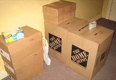
A fundamental understanding of the CSS box model is essential to gaining a basic understanding of CSS in general. The good news is, if you can pack a box in real life, you can understand the CSS box model. And if you can’t pack a box in real life due to some traumatic physical injury, you shouldn’t have much of a problem, either. Also, I’m sorry about bringing up the whole box thing.
The basic premise behind the box model is this: Every single element on a web page, no matter how big or small, is a box. Got that? Anything that starts with a <tag> and ends with a </tag> is a box (container, whatever). So a <p> tag is a box, which is maybe inside of a <div> box, inside of a <body> box, inside of a <html> box. And with CSS, what you’re really doing is manipulating the size, shape, color, decoration and so forth of that box and its contents.
So what’s the box model? The box model is an agreed-upon (mostly… I’ll get to that in a bit) set of standards for how web browsers will display (model) the content (boxes) on a page. And what does that have to do with you? Well, if you want to style the content on your site, it’s a good idea to know how the rules you write will be displayed.
So here are the most basic properties you have to worry about when dealing with the box model: border, background, padding, width and margin. We’ll go through these properties one by one below. And to help it make sense, we’ll relate it to how you’d pack a box in real life.
- Border: This is the box. When you’re starting out, it helps to think of the border as the outline of a real box. It can have different thicknesses (widths) and colors, but its basically just a rigid structure you put things into. Of course, you can also have a border of zero, but it still helps to think of the border as the outermost part of your box, even if it isn’t there.
- Background: If you apply a background to something, it stretches from one side of the border to the other, covering the entire inside of your box. Also, if you apply both a background color and a background image, the image will sit on top of the color.
- Padding: Think of padding as the bubble wrap or packing peanuts you’d add to a box before shipping it somewhere. Padding lies between your border and your content. This is the sanest property of the lot.
- Width: This is the width of your content inside your box. This can be somewhat counter-intuitive at first, because it is not the width of your border. It’s the width of the stuff inside your border, and inside your padding. So if you set a width of 400 pixels, with 20 pixels of padding on both sides, and a 5-pixel border, your actual “box” would be 400+20+20+5+ 5 (otherwise known as 450) pixels wide.
- Margin: Margins exist outside of our hypothetical box, around your border. Think of it as space outside your box that you’re deliberately leaving empty, as if the stuff inside the box were volatile, dangerous, stinky, or otherwise something you’d want to give a wide berth. So if you took our box from the width example and gave it a 10 pixel margin on every side, we’d now have a 450 pixel wide “box” taking up 470 pixels of space.
And that’s really all there is to the box model! Well, at least it would be, except for one teensy-weensy little browser that does things a little bit differently. It’s called Internet Explorer. Perhaps you’ve heard of it.
Here’s how it differs: Instead of counting the width as the width of your content, Internet Explorer counts it as the width of everything related to your box. I’ll explain. Let’s say you set the following rules in your style sheet:
box {
width: 400px;
padding: 20px;
border: 5px solid black;
margin: 10px;
}
Look familiar? That’s our box from the example above. And as explained, browsers following the box model will give your content 400 pixels of wiggle room, surrounded by a total of 70 pixels of other stuff around it. But Internet Explorer behaves differently. Basically, instead of adding like we did, IE will subtract. So instead of ending up with a 400+40+10+20=470 pixel wide space, IE gives you a 400 pixel wide space with 400-40-10=350 pixels of space inside for your content, with 20 pixels of margin around it.
What’s the good news? Well, if you write your XHTML properly and include an appropriate DOCTYPE at the beginning of your page, everything from IE 6 and newer actually behaves like they should. So really, this is only a problem for IE 5.5 and below, assuming you’re using good DOCTYPEs. For more in-depth detail on IE and the Box Model, I’d suggest reading this fantastic article on 456 Berea Street.
