
Input fields are often overlooked when it comes to styling, which is a shame because there are so many cool things that can be done to them to make them look stylish, cool, and the opposite of plain and boring. In this tutorial, we’ll show you how to add some style and animation that will make any old input field look sleek and sophisticated. This tutorial is adapted from a CodePen snippet.
The HTML
To start, you’ll need some basic HTML. Here’s what ours looks like:
<div class="text-input">
 <input type="text" id="input1" placeholder="Click me to see the animation!">
 <label for="input1">Email</label>
</div>
So we’ve got a div that functions as a wrapper, followed by the actual input field (the placeholder text can say whatever you like), and the label that goes with your input — in this case, it’s “Email”, but this can also be completely customized.
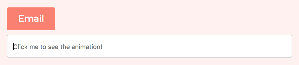
Right now with no styling, your input field should look like this:
Not exactly cute. Let’s remedy this by adding some CSS.
The CSS
body{
 display: flex;
 flex-direction: column;
 align-items: center;
 justify-content: center;
 height: 100vh;
 font-family: Montserrat;
 background: #fff1f0;
}
.text-input{
 position: relative;
 margin-top: 50px;
}

 input[type="text"]{
 display: inline-block;
 width: 500px;
 height: 40px;
 box-sizing: border-box;
 outline: none;
 border: 1px solid lightgray;
 border-radius: 3px;
 padding: 10px 10px 10px 100px;
 transition: all 0.1s ease-out;
 }

 input[type="text"] + label{
 position: absolute;
 top: 0;
 left: 0;
 bottom: 0;
 height: 40px;
 line-height: 40px;
 color: white;
 border-radius: 3px 0 0 3px;
 padding: 0 20px;
 background: #fa8072;
 transform: translateZ(0) translateX(0);
 transition: all 0.3s ease-in;
 transition-delay: 0.2s;
 }

 input[type="text"]:focus + label{
 transform: translateY(-120%) translateX(0%);
 border-radius: 3px;
 transition: all 0.1s ease-out;
 }

 input[type="text"]:focus{
 padding: 10px;
 transition: all 0.3s ease-out;
 transition-delay: 0.2s;
 }
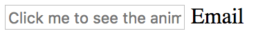
Here’s what the input field should look like after the CSS is applied to it:

What our CSS accomplishes is not only adding style (some of the stylistic touches include adding a nice border and border-radius to our input field, using a fresh font, and adding some much needed padding) to our input element, but also adding an animated effect. The effect is achieved by using CSS’s transition property. The animation happens when the input field is focused on. So when the user clicks the input field where the placeholder text reads “Click me to se the animation!”, the “Email” label smoothly shifts position to above the input field, and the placeholder text shifts smoothly all the way to the left side of the input field so it’s not sitting at a position with an awkward left margin.
The effect looks like this:

When the input field stops being in focus (this means whenever you click anywhere outside of the input field), the input field label and the text it contains smoothly reposition themselves back to their original places.
This snippet is fully customizable and when you use it you’re able to easily change the colors, fonts, sizes, and transition duration or style to suit the needs of your project. Feel free to use the styling or the animated transition effect (or both!) on the input fields for any of your sites.